The UI kit
Русская версия: ru/ui.md
@checkout-kit/ui is the visible half of the checkout: the fields a shopper types a card into, the screens a payment moves through, and the tokens that make it look like your product rather than like a library.
It is plain CSS and plain React. No framework, no CSS-in-JS, no icon package, no runtime dependencies at all.
Install from npm
npm install @checkout-kit/core @checkout-kit/ui react@^19 react-dom@^19npm package · All installation options
Import @checkout-kit/ui/styles.css once. For CheckoutRoot in the example below, also install @checkout-kit/react and @checkout-kit/runtime-browser.
import '@checkout-kit/ui/styles.css'Then put ck-root on a wrapper, or use CheckoutRoot, which also carries the theme and the platform:
import { CheckoutRoot } from '@checkout-kit/react'

;<CheckoutRoot theme="auto">…</CheckoutRoot>
Everything is scoped under that element, and it all sits in a checkout cascade layer, so your own CSS wins without a specificity fight. If you use layers too, say where ours goes:
@layer theme, base, components, checkout, utilities;With Tailwind that means importing its parts, so the kit lands after preflight - which would otherwise reset the buttons it draws - and before utilities:
@layer theme, base, components, checkout, utilities;
@import 'tailwindcss/theme.css' layer(theme);
@import 'tailwindcss/preflight.css' layer(base);
@import '@checkout-kit/ui/styles.css';
@import 'tailwindcss/utilities.css' layer(utilities);
Preview a complete checkout
Open the live gallery. The first example combines an order, editable contact details, saved/new card choices and bank transfer. Switch Preview state to inspect waiting, success and decline; use Frame width for 390px and 320px containers. This workshop never creates a payment or stores a card.
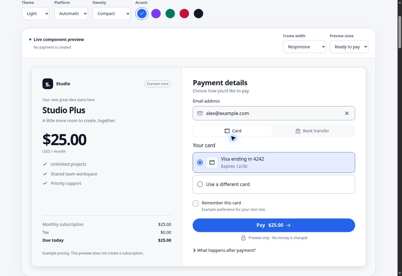
The default styling uses neutral surfaces, a blue accent, pill actions and 16px input text. Controls keep native form behavior and keyboard access. The catalog below the preview shows individual components with the same theme, platform, density and accent.
Theming
Three tiers of custom property. You normally touch one of them.
| Tier | Examples | Changes |
|---|---|---|
| Primitives | --ck-p-accent-500 | The brand color used to derive interactive tones. |
| Semantics | --ck-accent, --ck-control-border, --ck-text | A role shared across components. |
| Component | --ck-button-radius, --ck-input-height | One control's geometry. |
Move a primitive and everything below it moves. Set a semantic token and only that changes.
Rebrand everything by moving the accent. The hover, pressed, subtle and focus tones are derived from it, so they move together and stay in step:
.ck-root {
  --ck-p-accent-500: #047857;
}
Change one thing by setting the semantic token for it:
.ck-root {
  --ck-radius: 8px;
  --ck-control-height: 3rem;
  --ck-font: 'Inter', system-ui, sans-serif;
}
Choose an accent with readable text in every state. The kit does not calculate contrast at runtime. For a light accent set --ck-accent-contrast (or accentContrast) to dark text. The gallery's Ink example uses a dark action in light mode and a light action in dark mode.
The semantic tier is what the rules read: --ck-accent, --ck-surface{,-raised,-sunken}, --ck-border{,-strong}, --ck-text{,-muted,-subtle}, --ck-danger, --ck-success, plus scales for space (--ck-space-1…12), type (--ck-font-size-xs…2xl), radius, control heights, focus ring and motion. The primitive tier underneath (--ck-p-*) is the raw ramps.
One is worth knowing by name. --ck-scrim is what the sticky action bar fades into. The kit cannot know your page's real background, so override it if the default is wrong:
.ck-root {
  --ck-scrim: #fff;
}
From JavaScript, if your brand lives in a token pipeline rather than a stylesheet. appearanceToStyle() returns the same properties you would have written by hand:
import { appearanceToStyle } from '@checkout-kit/ui'

;<CheckoutRoot theme="auto" style={appearanceToStyle({ accent: '#047857', radius: 8 })}>
Numbers are pixels, strings are used as written. Anything it does not cover is still one line of CSS on .ck-root.
Density. <CheckoutRoot density="compact"> tightens the gaps and control heights, for a checkout embedded in someone else's page or running in a WebView. The minimum tap target does not move with it: a tight layout is a choice, a target too small to hit is not.
Light and dark. Dark is the default. Set data-ck-theme="light" for light, or data-ck-theme="auto" to follow the system. Only the semantic tier is redefined, so a light theme is the same brand rather than a second one.
<div class="ck-root" data-ck-theme="auto">…</div>Motion, contrast and touch are handled through the same tokens: one prefers-reduced-motion block sets every duration to nothing, because no rule hard-codes one; prefers-contrast: more strengthens borders and the focus ring; pointer: coarse raises the minimum tap target to 48px.
Platform conventions. An iPhone and an Android disagree about the font, the corner radius and what a press looks like, and CSS cannot see which one it is on. CheckoutRoot detects it; without React, call applyPlatform(root) from @checkout-kit/runtime-browser once at startup. Pin it with platform="ios" to check a layout, or leave the attribute off entirely and everything falls back to the desktop values.
Everything else - touch, hover, colour scheme, contrast, motion - stays a media query, because those the browser does know.
Layout is measured against the container, not the window. .ck-root is a container, and every layout decision is a container query. The same checkout renders full-page, in a 360px WebView and inside a merchant iframe of unknown width - a viewport query is wrong in two of those three.
The components
You can see all of it in the demo's /gallery route: every component on one page, with switches for theme, platform, density and accent.
Where the main ones sit on a checkout screen:
| Part of the screen | Compose with |
|---|---|
| Order and amount | OrderSummary, Money, Panel, PromoCodeInput |
| Payment choice | PaymentMethodSelector, SavedInstrumentList, OptionCardGroup |
| Shopper details | Field, InputGroup, Input, ContactFields, AddressFields |
| Provider collection / challenge | SDK-owned fields inside ActionFrame |
| Submit and outcome | PaymentButton, PaymentStatus, result screens and Receipt |
The payment then ends on one of the state screens - ProcessingState, AuthenticationState, SuccessState, FailureState - which replace the form rather than sit inside it.
Form. Field is the one to know. It gives a control an id, points the label at it, and names the hint and the error in aria-describedby. Every input in the kit goes through it, which is why no screen has to remember to do it.
<Field label="Email" hint="Where the receipt goes" error={errors.email?.message} required>
  {(control) => <Input {...control} type="email" autoComplete="email" />}
</Field>
FieldGroup is a <fieldset> for fields that ask one question together, like a billing address, and FieldRow pairs two short ones side by side once there is room for both - and lines their controls up even when only one of them carries a hint.
Besides Input there is Select, Textarea and Checkbox. Checkbox does not go through Field: its label belongs beside the box, not above it, so it takes its own label, description and error. It is what accepts terms and saves cards.
Input composition and icon actions. InputGroup supplies a shared surface for a leading decorative icon and trailing text or action. It carries the input's focus and error styling. Spread Field props and your form ref onto Input, so labels and errors stay wired. IconButton requires label; its children are decorative. Keep leading content decorative and label every interactive trailing control.
<Field label="Receipt email" error={emailError}>
  {(control) => (
    <InputGroup
      leading={<MailIcon />}
      trailing={
        <IconButton label="Clear email" onClick={clearEmail}>
          <CloseIcon />
        </IconButton>
      }
    >
      <Input {...control} type="email" ref={emailRef} autoComplete="email" />
    </InputGroup>
  )}
</Field>
When a clear action removes itself, return focus to the input in its handler. Disable its trailing actions when your form requires them to be unavailable.
Address and contact. AddressFields and ContactFields exist for one reason: autocomplete. Every token they set is one a browser recognises, and one wrong token turns autofill off for the whole form. The country list is yours - the kit includes no country data. autoCompleteSection keeps a billing and a shipping address filling separately.
Money. Amounts travel in minor units. formatMoney in @checkout-kit/core turns them into what a shopper reads, asking Intl how many minor units a currency has instead of carrying a table. That is the part hand-written formatters get wrong: JPY has none, KWD has three. <Money amount={1999} currency="USD" /> renders it with tabular figures.
OrderSummary puts the lines together. It does no arithmetic - subtotals, tax and discounts arrive already worked out, because where the rounding lands is your tax logic's business.
The rest. PromoCodeInput (an input with an apply button; not a nested <form>), SavedInstrumentList (an expired card is shown disabled, not hidden, so someone looking for it can see why), ExpressCheckout (a slot row and a rule - every wallet mandates its own button, so you bring the one their SDK draws), TrustStrip, Steps, Skeleton, SkeletonText, Countdown (for action.expiresAt; silent while it runs, announced when it expires), CopyButton, Disclosure, Divider, Panel and Receipt.
Dialog is a real <dialog> opened with showModal(). That is why the kit has no focus-trap code: focus, Tab, inertness, Escape and focus restore are all the browser's. variant="sheet" anchors it to the bottom edge and limits its width on desktop. The visible close button uses closeLabel, and description is connected with aria-describedby. dismissible={false} hides the close button and refuses backdrop/Escape dismissal; provide an explicit completion action for that step.
ValidationSummary is the other half of Field's polite errors. Since those do not interrupt, nothing otherwise says how many problems a long form has on submit. It takes focus, counts them, and links each to its field.
Card entry. CardNumberInput, ExpiryInput, CvcInput, CardholderInput, laid out by CardFields. They format as you type without throwing the caret to the end, group the digits the way the brand prints them - 4-6-5 the moment an Amex prefix appears - and take their lengths from the same rules the validator uses, so a mask and a message can never disagree. The brand shows as a text badge; scheme logos are trademarks, so pass your own through icons if you have the licence.
Choice. OptionCardGroup and OptionCard are real radio buttons, hidden and styled through :has(:checked). Arrow keys, form semantics and the screen-reader announcement come from the browser. PaymentMethodSelector is the same thing with payment metadata, and the methods come from you - the kit has no list of its own.
<PaymentMethodSelector
  methods={[
    { id: 'card', label: 'Card', description: 'Visa, Mastercard, Amex' },
    { id: 'transfer', label: 'Bank transfer', badge: 'Instant' },
  ]}
  value={method}
  onChange={setMethod}
/>
Payment. PaymentStatus is the single live region on the page: what happens to the money is what gets announced, and field errors stay polite so they do not drown it out. PaymentButton shows a spinner and stops responding while a payment runs, but keeps its label and its focus. It also prevents the native submit action while busy; Button honors aria-disabled supplied by the host. A label that changes mid-payment moves the target under the cursor, and a disabled button drops focus to the top of the page.
ProcessingState, AuthenticationState, SuccessState and FailureState are the screens a payment ends on. Each leads with a heading. SuccessState and FailureState take focus on arrival; processing and authentication focus remain under the host's control. For a static catalog set autoFocus={false} on result screens and announce={false} on PaymentStatus. Actual outcomes retain those defaults. Cancellation uses a neutral icon and color.
CheckoutLayout is the column, with an optional aside for an order summary: above the form on a phone, sticky beside it from 48rem. ck-panel is an opt-in raised surface for whatever goes in it.
ActionFrame is where a provider draws. Three variants, because a hosted field frame, a bank page and a QR code want three different sizes:
<ActionFrame variant="challenge">
  <PaymentActionHost className="ck-action-host" />
</ActionFrame>
Accessibility, and where the line is
The kit gives you: a label and an error tied to every field, one alert and one status region rather than a scatter of them, a visible focus ring on every control, a real tab pattern with arrow keys, radio groups the keyboard can reach, 44px targets by default (48px for coarse pointers; desktop permits 36px small actions), and result screens that take focus. Compact density preserves the platform's target size.
You still own: where focus goes when your routes change, and any announcement that belongs to your layout rather than to the payment. The kit does not own your page, so it cannot do those for you.
Translation
Every string the kit renders can be replaced. There is no i18n library in here, and no opinion about which one you use.
<PaymentStatus state={state} messages={{ processing: t('checkout.processing') }} />
<PaymentButton state={state}>{t('checkout.pay')}</PaymentButton>
<SuccessState heading={t('checkout.paid')} />
The runners in @checkout-kit/runtime-browser take their strings the same way - see createBrowserRuntime({ redirect: { frameTitle }, display: { text } }).
What you should not translate is PaymentError.message: those are the issuer words, and they are what the shopper repeats to their bank. Branch on PaymentError.code if you need your own wording, and fall back to the message for codes you do not know.
Verify your composition
Run npm run test:ui in a source checkout. The browser suite covers desktop Chromium, Android-sized Chromium, iPhone-sized WebKit and a 320px viewport. It checks WCAG A/AA rules with axe across both themes and five accents, keyboard tab/radio choices, sheet dismissal and focus restoration, narrow container overflow, target sizes, RTL and reduced-motion results. CI attaches screenshots and a Playwright report. Automated checks cover detectable rules; review your final copy, provider frames and screen-reader flow in your own application.